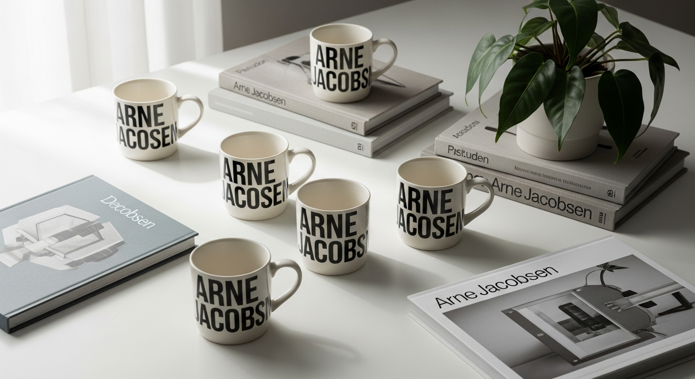
Nearly 90 years after Danish architect Arne Jacobsen created his distinctive hand-drawn typeface for Aarhus City Hall in 1937, his iconic typography still captivates design enthusiasts worldwide. The typeface has transcended its original architectural context to become a symbol of timeless Scandinavian design, recognized and celebrated across generations. What began as a single creative vision for a civic building has evolved into a cultural touchstone that resonates with anyone who appreciates thoughtful, elegant design.
Design Letters has mastered the art of blending Bauhaus minimalism with functional everyday objects, transforming Jacobsen's legendary typography into ceramics and drinkware that bring meaning to daily routines. The brand understands that great design isn't about complexity—it's about clarity, purpose, and the ability to enhance ordinary moments with extraordinary beauty. By pairing Jacobsen's alphabetic letterforms with carefully selected materials, Design Letters created products that work as hard aesthetically as they do functionally.
The Arne Jacobsen Typography Cups represent more than just beverages—they're tangible expressions of Scandinavian design philosophy that invite personalization, storytelling, and intentional living. This guide examines the design story behind Jacobsen's legendary typography, explores different material options from fine bone china to medical-grade plastic, identifies which versions suit specific needs, and provides insights into caring for your collection.
Explore the complete Design Letters Arne Jacobsen Typography Cup collection.
The Design Legacy Behind Arne Jacobsen's Typography
Origins of the typeface created in 1937 for Aarhus City Hall
Arne Jacobsen designed his distinctive hand-drawn typeface specifically for Aarhus City Hall in 1937, a commission that placed his letterforms at the heart of Denmark's urban identity. Rather than selecting an existing typeface, Jacobsen chose to create something original—a decision that reflected his broader architectural philosophy of designing every element within a space, from the structural framework down to the smallest typographic detail. This typeface became inseparable from the building itself, etched into signage and wayfinding systems that guided visitors through the civic space.
The letterforms Jacobsen created were neither rigid nor cold, despite their modernist origins. Each character carried subtle proportions and generous curves that balanced geometric precision with human warmth. This quality transformed the typeface from a purely functional tool into something genuinely beautiful—something people noticed and remembered long after leaving the building.
Bauhaus design principles embedded in the letterforms
Jacobsen's training and exposure to Bauhaus philosophy profoundly shaped his typeface design. The Bauhaus movement championed the integration of form and function, rejecting ornamental excess in favor of essential clarity. Jacobsen's typography reflects these principles through its restrained geometry, consistent proportions, and elimination of unnecessary flourishes. The letters are legible without sacrificing personality—they possess character while remaining fundamentally practical.
The typeface exemplifies the Bauhaus belief that good design should be invisible in its efficiency yet undeniably present in its impact. When you encounter Jacobsen's letterforms on a cup, you're not wrestling with confusing proportions or struggling to read the character. The design simply works, and that seamless functionality allows you to appreciate the aesthetic qualities underneath.
Why Jacobsen's font remains modern and relevant after nearly nine decades
Nearly nine decades have passed since Jacobsen sketched these letters, yet the typeface resists the dated quality that typically afflicts historical design work. This durability stems from Jacobsen's commitment to timelessness rather than trendiness. He didn't design letters that shouted "1937" through excessive stylization. Instead, he created forms that embodied fundamental principles of proportion and clarity that transcend any particular era.
The typeface endures because it solves a design problem that remains constant: how to communicate through letterforms with grace and efficiency. Jacobsen's solution feels neither nostalgic nor aggressively contemporary. It simply exists as design that works, which means each new generation discovers it without the burden of historical baggage. A 25-year-old seeing Jacobsen's letters today doesn't perceive them as "retro"—they perceive them as intentional, refined, and distinctly Nordic.
The connection between architectural vision and everyday drinkware
Jacobsen's architectural practice always emphasized the relationship between buildings and the people inhabiting them. He understood that spaces shape human experience through countless small interactions—the height of a doorway, the curve of a chair, the legibility of signage. This philosophy extended naturally to objects. For Jacobsen, designing a chair or typeface wasn't a departure from architecture; it was architecture at a different scale.
When Design Letters selected Jacobsen's typography for drinkware, they honored this philosophy by placing his letterforms into objects that people interact with multiple times daily. A cup adorned with Jacobsen's letters brings his architectural vision into intimate, personal space. The morning ritual of reaching for your coffee cup becomes a moment of engagement with authentic design. This represents the ultimate vindication of Jacobsen's belief that good design should inhabit everyday life.
Material Options: Choosing the Right Cup for Your Lifestyle
Fine bone china and porcelain variants for sophisticated home displays
Design Letters offers Arne Jacobsen Typography Cups in fine bone china and porcelain, materials that elevate these pieces beyond functional drinkware into objects worthy of prominent display. Fine bone china contains a high percentage of bone ash, which creates a material simultaneously delicate in appearance and remarkably chip-resistant. This paradox of fragility and durability makes fine bone china ideal for pieces that bridge practical use and aesthetic appreciation.
Porcelain variants, particularly those featuring the "Arne Jacobsen Vintage" or "Favourite Cup" series, deliver the refined, sophisticated aesthetic that defines Scandinavian design at its best. These cups work equally well cradled in your hands during morning coffee or arranged on open shelving as part of a curated kitchen display. The subtle weight and cool smoothness of porcelain create a sensory experience that plastic simply cannot replicate. For adults who value design intention in their domestic spaces, porcelain represents the definitive choice.
Ultra-matt glazed finishes with laser-engraved letters and durability benefits
Some porcelain cups feature an ultra-matt glazed finish combined with laser-engraved letters, a combination that delivers both aesthetic refinement and practical benefits. The matte surface eliminates reflective gloss, creating a sophisticated appearance that photographs beautifully and feels substantive in hand. Laser engraving ensures the letterforms maintain perfect clarity and precision, creating a visual distinction between the character and the cup's surface.
The ultra-matt finish provides enhanced durability compared to glossy alternatives, resisting fingerprints and minor surface imperfections that might otherwise accumulate on frequently-used items. This finish does require a certain care approach—using wooden or silicone utensils rather than metal cutlery helps preserve the delicate surface—but the payoff is a cup that ages gracefully and improves aesthetically through extended use.
Melamine cups: affordability, drop-resistance, and practical limitations
For families with children or anyone prioritizing durability over aesthetic refinement, melamine cups offer genuine practical advantages. These cups cost between $10 and $14, making them accessible entry points into the Arne Jacobsen Typography collection. Melamine resists breaking from drops that would shatter ceramic alternatives, and the material maintains its bright, cheerful appearance through years of enthusiastic use.
The practical limitations of melamine deserve acknowledgment: the material can crack under excessive impact, shouldn't be placed in the microwave, and typically requires hand-washing rather than dishwasher cycles. These constraints matter less for younger children who may be developing their relationship with ceramic cups, but they position melamine as a temporary solution rather than a lifetime investment. Consider melamine cups as gateways to design appreciation rather than final expressions of it.
Tritan medical-grade plastic: BPA-free safety for families with children
Design Letters offers cups made from Tritan, a medical-grade plastic that eliminates concerns about BPA exposure while maintaining remarkable durability and heat resistance. This material represents the brand's commitment to family-centered design, acknowledging that children deserve beautiful, intentionally designed objects without requiring parents to compromise on safety standards. Tritan cups are robust, drop-safe, and microwave and dishwasher safe, addressing the practical realities of households with young children.
The quality distinction between Tritan and standard plastic is substantial. Tritan maintains clarity and color fidelity over extended use, doesn't develop odors or stains, and genuinely performs like a premium material rather than a budget compromise. For parents wanting to introduce their children to design appreciation while maintaining realistic expectations about durability, Tritan represents an intelligent investment.
Discover which material option matches your lifestyle and design preferences.
Personalization and Gift-Giving Possibilities
Single-letter customization for individual names and monograms
The defining feature of Arne Jacobsen Typography Cups is their individual letterform design—each cup typically features a single character from Jacobsen's alphabet. This approach transforms what could be a mass-produced commodity into a personalized object that carries meaning specific to the person holding it. A child's initial, a parent's monogram, a significant date rendered numerically—these personal touches elevate a cup from a container into an artifact of identity.
Single-letter personalization works beautifully for individuals who appreciate subtlety. Rather than emblazoning an entire name across a mug, a single significant letter creates intrigue and invitation. Visitors notice the character and often ask about its meaning, creating conversational moments that amplify the object's social and emotional value.
Spelling out complete names by collecting multiple cups
The alphabet-based design naturally encourages collecting, transforming individual cups into components of larger narratives. A family with three children might each receive a cup bearing their initial, gradually accumulating into a personalized collection that tells their story through typography. Parents collect cups spelling out their children's names. Partners exchange complete alphabets representing shared names or inside jokes.
This collecting impulse deepens emotional attachment to the objects. Each cup acquisition becomes a deliberate act rather than a passive consumption event. The collection grows intentionally, gaining value and significance through accumulation. A shelf displaying letters spelling "JACOB" means something profound to the family who assembled it.
Pre-designed options like Mom, Dad, and other popular words
Beyond individual letters, Design Letters offers curated combinations and popular words pre-assembled on cups. "Mom," "Dad," and similar options provide immediate personalization for those seeking simpler solutions. These pre-designed cups work especially well as gifts, eliminating the need for customization while maintaining the personal touch that makes these cups special.
Ideal occasions for gifted sets: birthdays, baby showers, graduations, housewarmings
Arne Jacobsen Typography Cups excel as gifts across virtually every significant life occasion. Baby showers pair perfectly with personalized cups bearing the newborn's initial or name. Birthday recipients appreciate cups featuring their name or age rendered in typography they'll actually display. Graduation gifts carry symbolic weight—a cup bearing someone's initial or initials represents both congratulations and encouragement toward their future. Housewarmings benefit from personalized cups that transform new spaces into homes infused with intentional design.
The giftability factor extends beyond the practical. These cups communicate that the giver understands design, values thoughtfulness, and recognizes the recipient's appreciation for objects that transcend basic functionality. A cup bearing someone's initial becomes a small daily affirmation that they were thought of, considered, appreciated.
Care, Maintenance, and Longevity Tips
Proper hand-washing techniques for ultra-matt glazed porcelain
Ultra-matt glazed porcelain cups benefit from gentle hand-washing in warm soapy water, using soft cloths or sponges that won't scratch the delicate surface. Avoid aggressive scrubbing or abrasive cleaning tools that might compromise the matte finish. Pat dry with a soft cloth rather than air-drying, which can leave water spots on the matte surface.
The matte glaze's beauty emerges through gentle handling. This isn't a limitation—it's an invitation to slow down and engage meaningfully with objects you own. The brief ritual of careful washing becomes a moment of intentionality rather than a chore.
Cutlery recommendations to avoid scratching delicate finishes
Metal cutlery can scratch ultra-matt glazed surfaces, so wooden or silicone stirring implements preserve the cup's appearance through extended use. This simple adjustment—selecting the right utensil—represents the kind of small consideration that distinguishes collectors from consumers. You're not sacrificing functionality; you're optimizing the relationship between object and user.
Dishwasher safety guidelines for different material types
Fine bone china and porcelain can technically withstand dishwashers, though hand-washing preserves their appearance longer. Melamine cups should never enter dishwashers, as the heat can compromise the material. Tritan cups handle dishwashers comfortably, though hand-washing remains preferable for the most delicate finishes. Always check specific product guidance, as different collections may have varying recommendations based on glaze type and material composition.
Microwave usage and heating considerations for each variant
Fine bone china and porcelain cups work beautifully in microwaves without concern. Melamine cups explicitly cannot be microwaved due to material limitations. Tritan cups, despite their robustness, benefit from brief microwave cycles rather than extended heating. The material's heat resistance is excellent, but brief exposure preserves appearance better than prolonged warming.
Styling Your Space with Arne Jacobsen Typography
Creating a cohesive Scandinavian kitchen aesthetic with personalized cups
Arne Jacobsen Typography Cups become anchors for broader Scandinavian design narratives within kitchen spaces. The clean lines, restrained color palettes, and functional beauty of these cups complement Nordic design principles that emphasize simplicity, utility, and honest materials. Pairing cups with other elements that share these values—light wood shelving, ceramic serving pieces, minimal hardware—creates spaces that feel intentionally curated rather than accidentally assembled.
Scandinavian design thrives on negative space and intentional gaps. Rather than filling every shelf, strategically position your cups to create visual breathing room. Let the typography speak. The letterforms themselves become decorative elements that require no additional ornamentation.
Open shelving displays that showcase letter combinations
Open shelving transforms cups from hidden kitchenware into visible design statements. Arranging cups to spell family names or significant words creates visual narratives that tell stories about who inhabits the space. The arrangement might be alphabetical, thematic, or purely intuitive—the methodology matters less than the intentionality behind it.
Photography of these displays particularly benefits from Jacobsen's design. The clean letterforms photograph beautifully in natural light, creating social media content that genuinely serves aesthetic purposes rather than functioning as mere product showcase. The typography itself becomes the subject, with the cup merely the vehicle for displaying it.
Mixing and matching with other Design Letters products
Design Letters extends the Arne Jacobsen Typography concept across various product categories, creating opportunities for cohesive collection-building. Pairing typography cups with coordinated plates, bowls, or textiles reinforces the design narrative and creates a more complete expression of Scandinavian minimalism. Mixing different materials—perhaps porcelain cups with melamine bowls—adds textural variety while maintaining visual coherence through shared typography.
Photography tips for styling cups in home décor content
Photographing Jacobsen Typography Cups rewards attention to light and composition. Natural window light reveals the typography's subtlety better than artificial illumination. Position cups at angles that showcase the letterforms while capturing the cup's form. Negative space enhances the image—isolated cups on simple backgrounds allow the typography to become the dominant visual element.
Styling with complementary objects—fresh flowers, quality ceramics, wooden utensils—creates context that reinforces the design intention. Avoid cluttering the frame with excessive props. Let Jacobsen's typography remain the protagonist.
Bringing Timeless Design Into Your Daily Routine
The Design Letters Arne Jacobsen Typography Cups represent something increasingly rare in our throwaway culture: objects that genuinely improve with age and memory. Whether you're drawn to the refined elegance of fine bone china, the practical durability of medical-grade Tritan for your children, or the complete alphabet set spelling out your family's story, these cups deliver on both aesthetic and functional levels.
The deeper significance of these objects extends beyond their visual beauty or material quality. Each cup becomes a small anchor point in daily experience—a deliberate choice to surround yourself with design that matters. Morning coffee tastes different when served in a cup bearing a letter that represents something meaningful. Your kitchen looks more thoughtfully arranged when shelves display personalized typography. The cumulative effect of these small acts of intentionality transforms how you inhabit your own spaces.
Start with a single letter that holds meaning and watch how it becomes the catalyst for building something more substantial. These cups spark conversations, inspire collecting habits, and transform ordinary moments into instances of intentional living. Friends and family will notice. They'll ask about the single letter adorning your cup, and you'll explain the design history, the personalization, the intention behind it. That conversation itself validates the purchase—you've acquired an object worth discussing.
Leave a Reply