The Morris & Co. Willow Boughs Wallpaper: Strategic Placement and Installation Guide
Pattern waste during wallpaper installation can cost homeowners hundreds of dollars—and Morris & Co.'s Willow Boughs, with its generous 18-24 inch vertical repeat, demands meticulous planning. This iconic design hasn't dominated Australian interiors by accident; it represents deliberate craftsmanship and thoughtful aesthetics meeting real-world practicality.
The Willow Boughs design, born in 1887 from William Morris himself, remains the bestselling wallpaper on Wallpaperdirect AU. Its soothing willow branches and entwining stems work across period homes and contemporary spaces alike, offering a versatility that few patterns achieve. The botanical motif carries historical weight while remaining accessible to modern sensibilities.
In this guide, I'll walk you through strategic placement decisions that maximize visual impact while minimizing waste. You'll learn which colorways suit specific rooms, how to calculate accurate yardage, and whether professional installation justifies the investment.
Browse Willow Boughs wallpaper options on Wallpaperdirect AU today.
Strategic Room Selection for Willow Boughs Impact
Living Rooms and Feature Walls
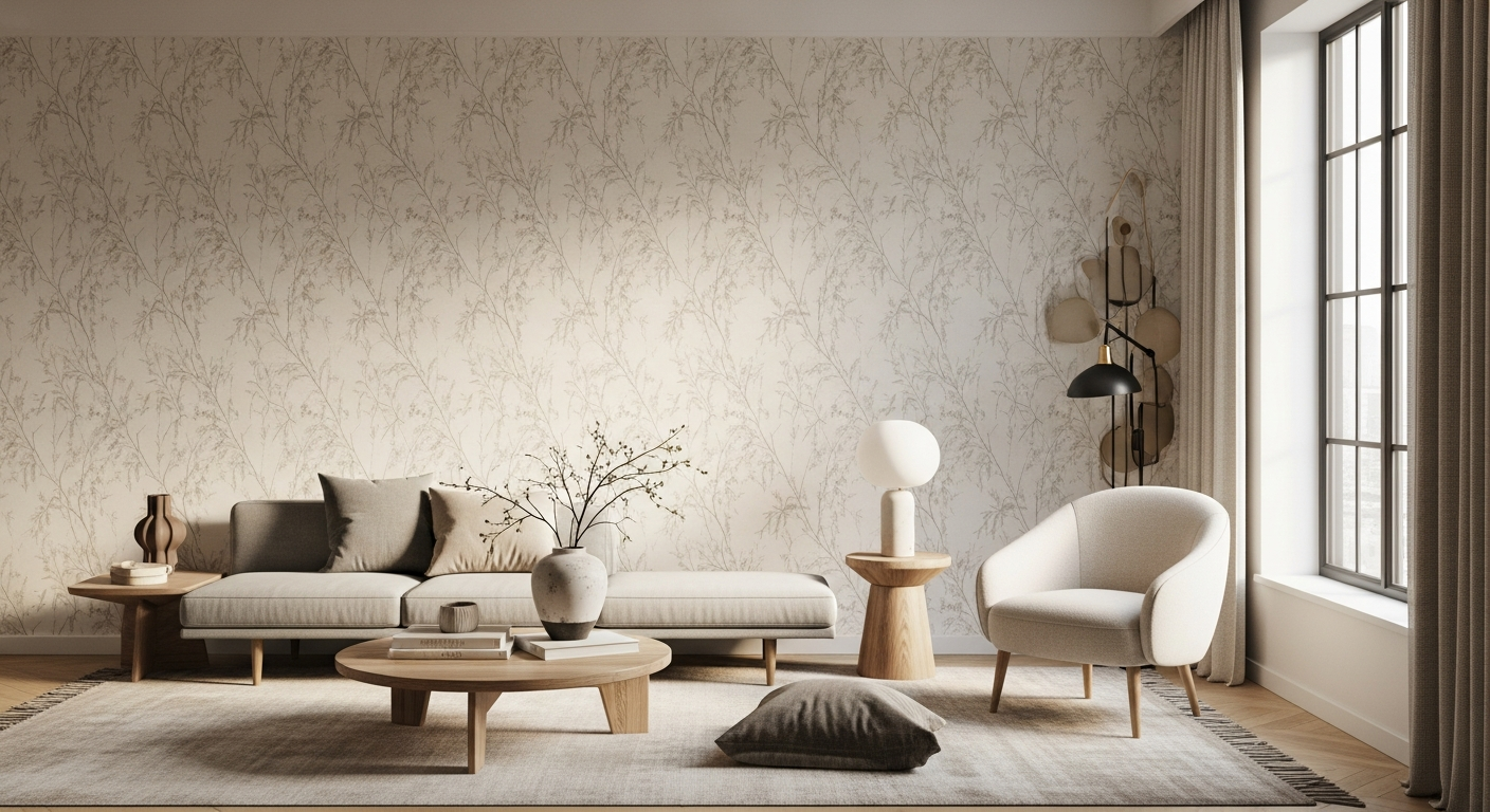
The living room presents an ideal canvas for Willow Boughs' commanding presence. The pattern's scale—with its flowing branches and interconnected leaves—commands attention without overwhelming open-plan spaces when applied to a single feature wall. A feature wall approach lets the pattern breathe, becoming a focal point that anchors conversation areas or frames architectural elements like fireplaces or shelving units.
The botanical drama works particularly well when positioned behind seating arrangements, where viewers encounter the pattern at a natural sightline. Avoid wrapping all four walls with this design in spacious living rooms; the repetition can feel suffocating rather than soothing.
Powder Rooms and Hallways
Smaller spaces amplify Willow Boughs' botanical detail and create intimate moments that larger rooms cannot achieve. Powder rooms benefit tremendously from this pattern because the enclosed space makes the eye naturally rest on the design. Hallways become gallery experiences, with the pattern unfolding as visitors move through your home.
These transitional spaces require less yardage, making them budget-friendly entry points for those testing the pattern in their home. A powder room with Willow Boughs establishes design confidence and provides daily visual pleasure during functional moments.
Bedroom Applications
Creating restful environments demands colorway choices that enhance sleep-friendly palettes. The traditional willow green on ecru and delft blue on porcelain colorways promote calm, particularly when applied to walls opposite the bed's foot. These cool-toned options signal relaxation and align with research showing that nature-inspired patterns support better sleep quality.
Applying Willow Boughs above the bed's headwall, rather than on all four bedroom walls, maintains visual balance while preserving the sanctuary feeling bedrooms require. Avoid the tomato/olive colorway in primary bedrooms; its warmth works better in studies or secondary spaces.
Studies and Home Offices
Balancing visual interest with focus-friendly environments proves essential for productive spaces. Willow Boughs succeeds in studies because the intricate pattern provides enough visual engagement to prevent monotony without triggering the distraction that more chaotic designs create. The pattern's orderly repetition actually supports concentration.
Position the wallpaper on walls adjacent to your desk rather than directly behind your monitor. This placement delivers the design's benefits while keeping your primary work zone visually simple.
Period Versus Contemporary Homes
Matching pattern placement to architectural style ensures cohesive design narratives. Period homes with original cornicing, fireplaces, and detailed trim work best with full-wall applications of Willow Boughs, as the pattern complements historical elements authentically. Contemporary homes with clean lines and minimal ornamentation benefit from feature-wall application, where the pattern becomes sculptural rather than decorative.
In converted period properties updated with modern elements, let the room's dominant architectural style guide your placement decision. A Victorian parlor with original woodwork calls for different placement strategy than a renovated cottage with contemporary finishes.
Avoiding Common Placement Mistakes
Which rooms and angles diminish the pattern's iconic qualities? Avoid applying Willow Boughs to walls with excessive natural light that creates glare, which flattens the pattern's depth. Kitchens with steam and cooking splatters present durability challenges, despite the washable specification. Laundry rooms and bathrooms with constant moisture fluctuations can compromise the paper substrate.
Don't place the pattern in rooms where it competes with competing focal points—a room already featuring bold artwork, statement furniture, or dominant architectural features doesn't need Willow Boughs fighting for attention.
Decoding Willow Boughs Colorways for Your Space
Traditional Palettes
Willow green on ecru, delft blue on porcelain, and linen beige colorways serve heritage-inspired interiors authentically. These combinations honor Morris's original aesthetic and work beautifully in homes featuring period furnishings, antique rugs, and traditional artwork. The willow green option particularly suits homes with existing green in upholstery or architectural elements like painted shutters.
Delft blue on porcelain speaks to classic interiors with a slightly more sophisticated edge, pairing naturally with porcelain collections or blue-and-white ceramic accessories commonly found in traditional homes.
Contemporary Colorways
Tomato/Olive and Olive/Turquoise options serve modern aesthetic applications where boldness balances historical reference. These colorways acknowledge Willow Boughs' heritage while speaking to contemporary palettes that embrace warmer undertones and unexpected color combinations. Contemporary spaces with neutral walls and minimalist furnishings gain genuine presence from these vibrant reinterpretations.
The olive base in both contemporary options bridges traditional and modern sensibilities, making these colorways excellent choices for transitional interiors.
Undertone Analysis
How to identify warm versus cool undertones and match them to existing furnishings becomes crucial when narrowing your colorway choice. Hold samples against your existing upholstery, curtains, and painted walls in various lighting conditions. The willow green and delft blue options carry cool undertones that complement gray, taupe, and cool white furnishings. The linen beige, tomato/olive, and olive/turquoise options warm toward beige, cream, and warm white color families.
Undertone mismatches create visual discord that no amount of careful placement can resolve. Spend time with physical samples rather than relying on online images alone.
Lighting Considerations
Why natural and artificial light dramatically shifts how colorways perform throughout the day cannot be overstated. North-facing rooms with consistent cool natural light suit the delft blue option beautifully, as the cool light enhances cool undertones. South-facing rooms with warm afternoon sun can wash out delicate colorways like willow green on ecru, making the tomato/olive or olive/turquoise options more resilient.
Artificial lighting matters equally—warm incandescent bulbs make greens appear murky, while cool LED lighting can intensify blue undertones to the point of coldness. Test samples under your actual lighting conditions for minimum 48 hours before committing to a purchase.
Coordination With Existing Décor
Pairing Willow Boughs with upholstery, artwork, and architectural elements requires honest assessment of your current palette. If your sofa is cream with blue-gray pillows, the delft blue on porcelain creates natural harmony. If your furnishings trend warm with terracotta accents and natural wood, the tomato/olive colorway feels intentional rather than conflicting.
Artwork should either feature complementary colors or remain neutral—avoid applying the pattern in rooms where existing art competes visually. Architectural elements like exposed wood beams, painted trim, or fireplaces must coordinate with your chosen colorway or recede into the background.
Single-Wall Versus Full-Room Installation
Strategic colorway decisions differ based on coverage approach. Single-wall installations with bolder contemporary colorways create gallery-like effects where the pattern commands focused attention. Full-room applications work better with traditional, softer colorways where the pattern becomes enveloping rather than overwhelming.
If you're uncertain about commitment level, start with a single-wall feature installation in a traditional colorway. This approach builds confidence and allows you to assess how the pattern performs in your specific light and space before expanding coverage.
Trend-Proofing Your Choice
Which colorways age gracefully versus those requiring periodic updates? The classic willow green on ecru and delft blue on porcelain remain timeless—they've proven their staying power across 139 years. These options won't feel dated in five years because they've already transcended trend cycles. The contemporary colorways—particularly tomato/olive—work beautifully now but may feel period-specific in a decade.
View your colorway choice as a long-term commitment. Wallpaper installation costs suggest this isn't a casual decision you'll easily reverse, so prioritize colorways with proven longevity over trendy interpretations.
Calculating Accurate Yardage and Minimizing Pattern Waste
Understanding the 18-24 Inch Vertical Repeat
Why this measurement matters for every wall in your project: the vertical repeat determines how much material you'll use and whether seams fall in visually optimal locations. A standard 8-foot wall requires different measurement considerations than a 10-foot wall because the repeat dimension affects how pattern sections align vertically.
Calculate your specific waste factor by dividing your wall height by the repeat measurement. A 96-inch wall divided by a 24-inch repeat yields exactly four repeats—zero waste. A 96-inch wall divided by an 18-inch repeat requires 5.33 repeats, creating unavoidable waste. Understanding your specific repeat dimension prevents purchasing inadequate material.
Standard Roll Specifications
A 20.5 inch width and 11-yard length breakdown provides approximately 50 square feet of coverage per roll. These measurements form the foundation for all subsequent calculations. British standard rolls differ slightly from North American specifications, so confirm you're working with Australian Wallpaperdirect measurements rather than converting from other sources.
Double rolls—essentially two standard rolls packaged together—offer better value for large projects and ensure dye-lot consistency across your entire installation.
Measuring Walls Accurately
Step-by-step process for capturing exact dimensions and accounting for doors and windows requires systematic documentation. Measure each wall's height at multiple points; older homes often have floors that slope, creating height variations. Record width measurements at ceiling, mid-wall, and floor level. These variations matter when calculating pattern alignment.
For windows and doors, measure the actual opening dimensions and note their distances from corners. Pattern alignment near architectural openings requires additional material calculations—horizontal repeats must match across openings when possible, demanding more yardage than simple square footage calculations suggest.
Pattern Matching Requirements
How straight-match patterns demand additional material for alignment can't be ignored in calculations. With a straight match like Willow Boughs, patterns must align horizontally across wall seams. This means every seam falls at the same point in the pattern's vertical cycle, preventing jarring visual breaks.
Straight matching requires adding extra material to account for vertical repeats that may need to be cut and discarded. A conservative waste allowance accounts for this systematic material loss during the matching process.
Calculate your exact yardage requirements with Wallpaperdirect AU's specification tools.
Waste Factor Planning
Industry standards account for 10-15% extra material to cuts and errors, but Willow Boughs' larger repeat pattern justifies targeting the higher end of this range. Professional installers routinely plan for 15-20% waste when dealing with 18-24 inch repeats. Underestimating waste forces difficult choices: proceed with inadequate material, risk running short and facing impossible color matching later, or purchase additional rolls at premium pricing.
Calculate waste conservatively. Better to have one leftover roll than to fall three feet short mid-installation.
Double-Roll Versus Single-Roll Purchasing
Cost analysis reveals that double rolls offer better per-unit pricing while ensuring consistent dye-lot batches across your project. Single-roll purchasing creates unnecessary complexity—tracking multiple rolls for dye-lot coordination and managing smaller inventory becomes cumbersome.
Most installations of Willow Boughs benefit from double-roll purchasing, which also simplifies inventory management and reduces administrative tracking during installation.
Creating a Cutting Diagram
Visual planning tools prevent expensive mid-project miscalculations. Before purchasing final yardage, create a scaled diagram showing each wall with door and window openings noted. Mark where seams will fall and trace the pattern progression across walls. This visualization reveals whether seams fall in visually acceptable locations or if slight adjustments to starting points would improve the finished appearance.
This planning exercise often identifies opportunities to minimize seams through strategic placement or reveals problematic seam locations that warrant adjusting your starting wall.
Accounting for Architectural Features
Fireplaces, built-ins, and unusual wall shapes complicate yardage calculations significantly. A fireplace breast requires separate measurement and individual calculation. Built-in shelving or cabinetry might create multiple wall sections requiring separate repeat calculations for each section. Angled ceilings in attic spaces or vaulted ceilings alter height measurements dramatically.
Document every architectural complexity with photographs and detailed measurements. Share this documentation with your installer or wallpaper retailer for their professional input before finalizing yardage.
Installation Methods: DIY Versus Professional Application
Non-Pasted Requirement
Why Willow Boughs demands separate adhesive application and what this means for your timeline differs from pre-pasted wallpapers. Standard Willow Boughs arrives as unpasted paper requiring paste application during installation. This approach offers benefits—the installer controls paste consistency and distribution, potentially improving longevity—but requires purchasing quality wallpaper paste separately and managing application logistics.
Plan additional setup time for paste preparation and application. Budget-friendly pastes work differently than premium formulations, potentially affecting installation difficulty and long-term adhesion.
Paste-The-Wall Washable Specifications
Care instructions and durability expectations post-installation center on the "paste-the-wall washable" designation. This specification means you apply paste to the wall rather than the wallpaper itself, reducing dampness exposure to the paper. The washable property allows gentle cleaning with soft, damp cloths—not vigorous scrubbing or abrasive cleaning methods.
Understand that "washable" doesn't mean "stain-resistant." Quick response to spills and gentle cleaning methods preserve the paper's refined finish. Aggressive cleaning damages the surface.
Paper Versus Non-Woven Options
Performance differences between traditional paper and non-woven substrates matter for installation outcomes. Standard paper versions require careful handling during installation—paste application must be controlled to prevent over-wetting the substrate. Non-woven options offer more forgiving installation characteristics; they resist tearing and handle excess paste more gracefully.
Premium non-woven versions cost more but justify the investment for DIY installers or homes with challenging wall conditions. The enhanced durability and forgiving installation characteristics reduce risk substantially.
DIY Installation Risks
Common mistakes compromise pattern alignment and longevity in frustrating ways. Pattern misalignment that goes unnoticed until multiple strips are hung becomes obvious upon completion—fixing it requires removal and reinstallation. Over-pasting causes paste to seep through the paper's surface, leaving permanent stains. Under-pasting leads to poor adhesion and premature peeling.
Horizontal alignment errors create visible diagonal shifts in the pattern across walls. These installation errors cannot be invisibly corrected; they remain permanently visible throughout the wallpaper's lifespan.
Professional Installer Benefits
Why Morris & Co.'s larger patterns justify expert application costs becomes clear when considering the installation complexity. Professional installers possess the experience, specialized tools, and techniques to handle large-repeat patterns that challenge less-experienced hands. They understand how to manipulate large wallpaper strips, maintain consistent pattern alignment, manage paste application precisely, and troubleshoot unexpected wall conditions.
The professional installation investment, while substantial, protects your wallpaper investment by virtually eliminating the installation mistakes that doom DIY efforts.
Cost Comparison
DIY savings versus professional installation pricing and potential rework expenses require honest calculation. Professional installation typically costs A$600-1200+ depending on wall area and complexity. DIY materials cost A$50-150 for quality paste, tools, and supplies. The apparent savings diminish dramatically if DIY installation requires removal and professional reinstallation—you've now paid for two installations while retaining the problematic first attempt.
Many homeowners discover mid-installation that Willow Boughs' scale challenges their skill level. At this point, removing partially installed wallpaper and calling professionals becomes increasingly expensive.
Drying Time and Curing
Proper ventilation and handling during the critical post-installation period determines long-term adhesion success. Wallpaper requires 24-48 hours of undisturbed drying in moderate temperature and humidity conditions. Opening windows or running air conditioning accelerates drying, while excess humidity extends the process dangerously.
Don't wash walls, close windows, or operate heating immediately after installation. Patience during curing ensures permanent adhesion and prevents peeling and buckling.
Maintenance and Cleaning
Long-term care strategies preserve the wallpaper's refined finish across decades. Dust the surface monthly with a soft brush or microfiber cloth to prevent dust accumulation that dulls the pattern. Address spills immediately with soft, barely damp cloths—blot rather than wipe. Avoid steam, harsh chemicals, and abrasive scrubbing.
Willow Boughs benefits from minimal intervention and gentle handling. The less aggressively you treat it, the longer it maintains its original beauty.
Bringing Willow Boughs to Life: Your Strategic Implementation Roadmap
The Morris & Co. Willow Boughs wallpaper represents far more than a decorative choice—it's a design investment that carries 139 years of proven appeal. Your success hinges on three critical decisions: identify which spaces truly benefit from this pattern's botanical drama, choose your colorway with intention considering existing palette and light, and commit to accurate measurement and proper installation. The premium pricing reflects genuine quality and historical significance. When you factor in longevity, timeless appeal, and the pattern's proven ability to complement diverse design aesthetics, the investment becomes clearer.
Start by measuring your target wall with precision, selecting your colorway based on existing light and décor, and honestly assessing whether professional installation fits your budget. A feature wall application in a traditional colorway represents a lower-risk entry point than full-room commitment. Consider starting with a powder room or hallway, where smaller yardage requirements and contained spaces reduce both financial and installation complexity.
Professional installation, while costly, protects your wallpaper investment through expertise that eliminates the pattern alignment and adhesion mistakes plaguing DIY efforts. The long-term perspective matters here—this isn't a temporary decoration but a design commitment lasting 10-20 years or longer. With thoughtful placement and proper execution, Willow Boughs will anchor your space beautifully for decades to come.
Leave a Reply